
What is Sushi Kuma?
Sushi Kuma is a real client from Monterey, California. They are a sushi/Japanese restaurant. Owners Dylan and Dominic Moon had approached our class asking for each of us to create a logo for them. We had 4 weeks to create a logo for them, and at the end they would pick their top logos.
At the end of the contest I was placed in their top 2 out of 30 students. However they never picked someone as their "winner"
Early Designs and Rationale
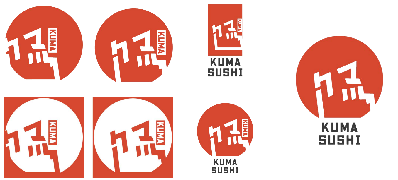
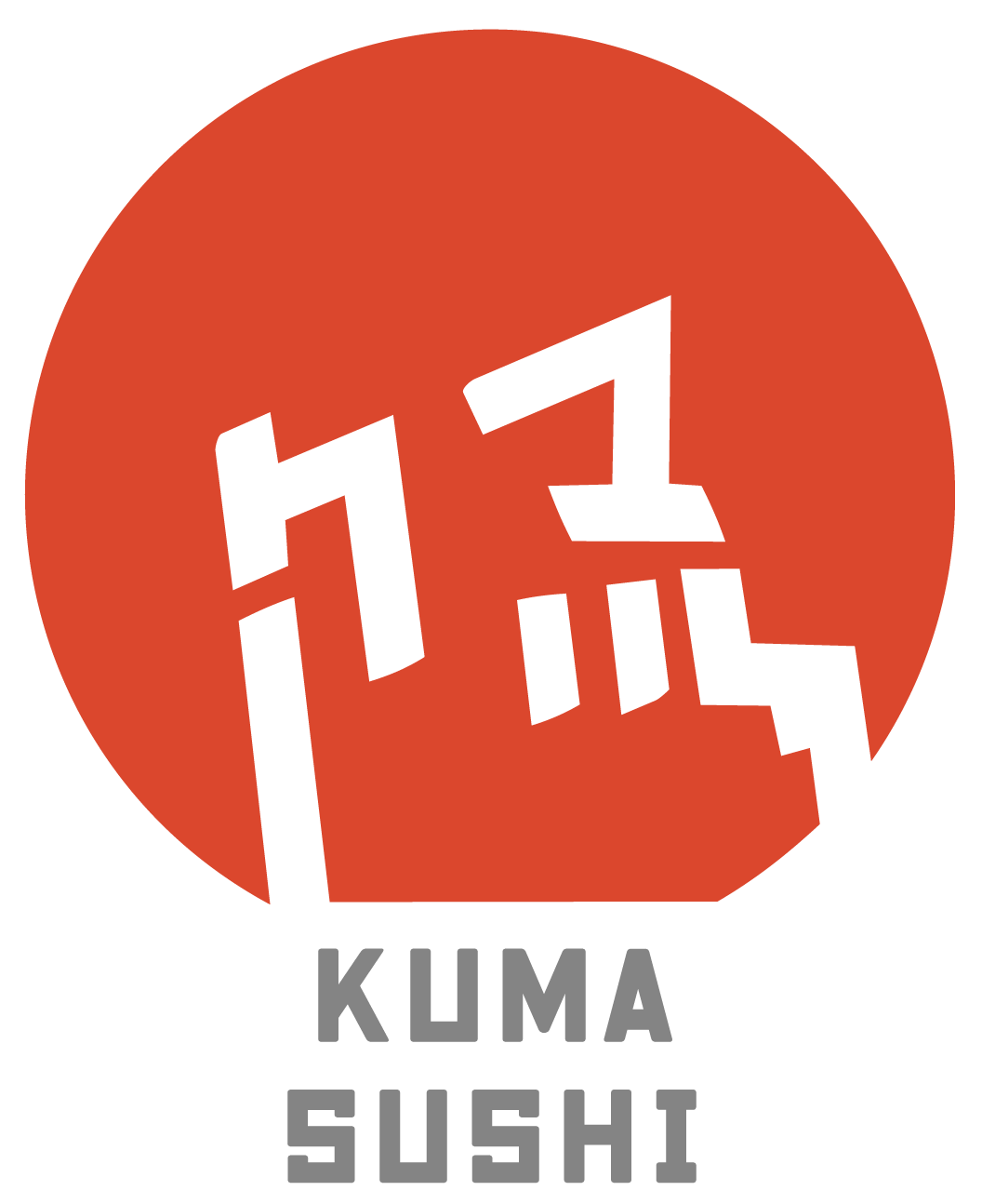
In Japanese "kuma" translates to "bear". When I met with Dylan and Dominic, They had stated that they were looking for a "Mascot style" logo. So I decided to make a bear for the logo. The ears of the bear contain the katakana for "Ku" and "Ma" (”ク”and”マ”) and the background is a red dot.
I included both of these aspects in my design to have multiple layers of depth in the logo. The red dot helps the average person understand its a restaurant relating to Japanese Cuisine. The Kuma ears are like a little easter egg for people who have the ability to read Japanese.